
Each of the flow articles and identity pages now include versions of a diagram showing how each of the flows fit into the landscape of technologies used in SSO and OAuth 2.0.
These are based on a diagram from a set created by Jesse Lingo, showing how the flows can be grouped by technologies involved and the context in which they're used:
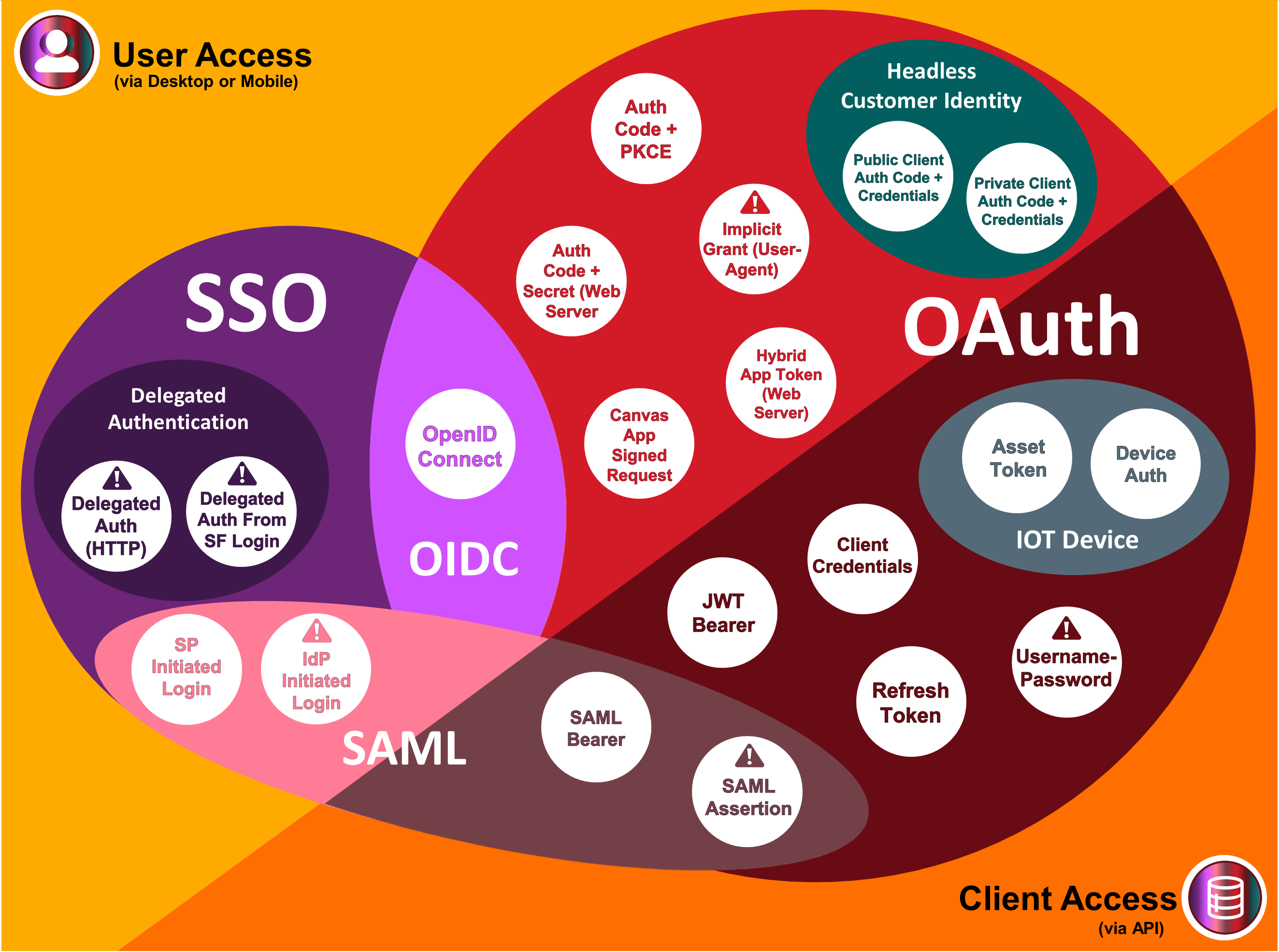
The aim of the content on our site is to simplify how to understand, contextualise and remember these flows, and the diagram Jesse first shared helped to do exactly this. While Jesse and I discussed the best ways to group the flows it became clear there could be a better way to organise the site content, so after settling on the best way to do this I've divided the site into the sections below:
Salesforce Single Sign On Flows, covering SAML, OpenID Connect and delegated authentication.
OAuth 2.0 Flows, which are further split into those typically used for:
Hopefully this helps with navigating and finding relevant flows!
I also love that the diagrams intentionally use colours which are easily discerned for those with accessibility needs. The colour palette and approach are based on Jon Jordan's article How We Designed Salesforce Maps to be Color Blind-Friendly.
It's been great to connect and collaborate to adapt this for the Cloud Sundial content, and it's wonderful to now include this across the site to help anchor the role of each flow in the a wider landscape. A huge thanks to Jesse for making the diagrams and being open to sharing in this way!
The identity landscape is just one of several diagrams Jesse has put together to help to simplify and communicate the identity concepts. If you'd like to find out more about this diagram or others do connect with Jesse on LinkedIn.